
2024
Esquina Latina
Branding and packaging for a handcrafted, gluten-free arepa brand. Inspired by Latin American roots, we created a warm and authentic identity that connects tradition, flavor, and origin.
Brand Strategy
Packaging Design
Know More
Branding and packaging for a handcrafted, gluten-free arepa brand. Inspired by Latin American roots, we created a warm and authentic identity that connects tradition, flavor, and origin.
About the Brand
La Esquina Latina is a Latin American food brand that brings tradition to the modern table. With handmade, organic, and gluten-free arepas, their mission is to honor ancestral recipes while delivering flavor, authenticity, and heart.
Rooted in cultural heritage, their offering is simple but powerful: clean ingredients, traditional methods, and a deep connection to the land.
What We Did
To bring La Esquina Latina’s essence to life, we developed a full visual and strategic system grounded in cultural storytelling and product authenticity.
Brand strategy & manifesto: We defined the core brand narrative with a manifesto that speaks from the heart and highlights its Latin American roots. This message became the foundation for all visual and verbal communication.
Visual identity system: The logo and brandmark were created to be instantly recognizable, yet emotionally resonant—honoring the handmade nature of the product with soft, organic forms.
Color palette & typography: The earthy, grounded color palette was selected to represent the ingredients, geography, and warmth of the culture. Typography blends nostalgia and clarity, reflecting both tradition and modern appeal.
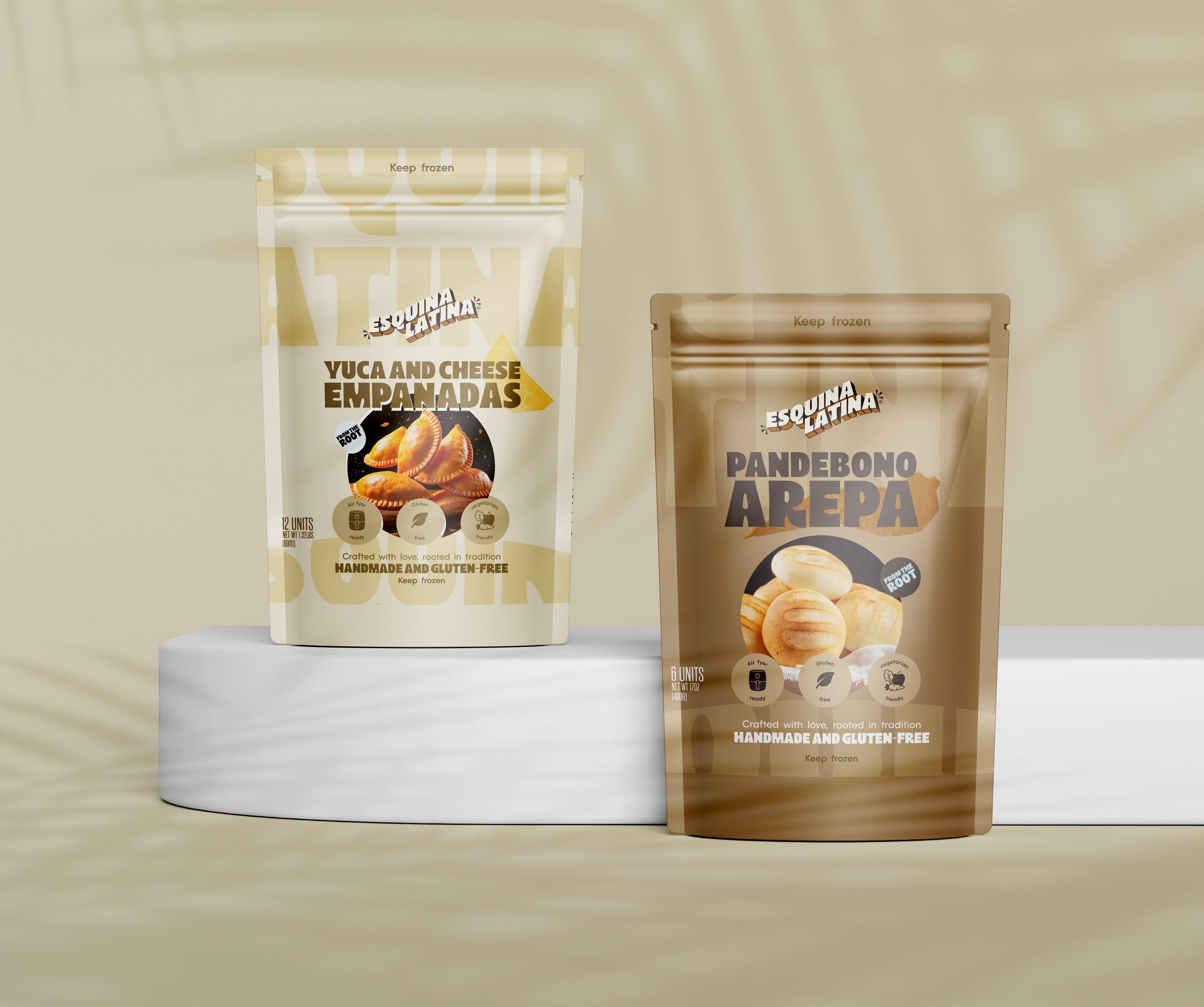
Packaging design: We designed packaging that communicates the artisanal, gluten-free promise of the brand. It’s clean but expressive, evoking a sense of care and origin.
Layout design for physical and digital touchpoints: Layout systems were built to be modular and consistent across formats, making the brand scalable and easy to apply in different contexts (menus, signage, print, digital, etc.).
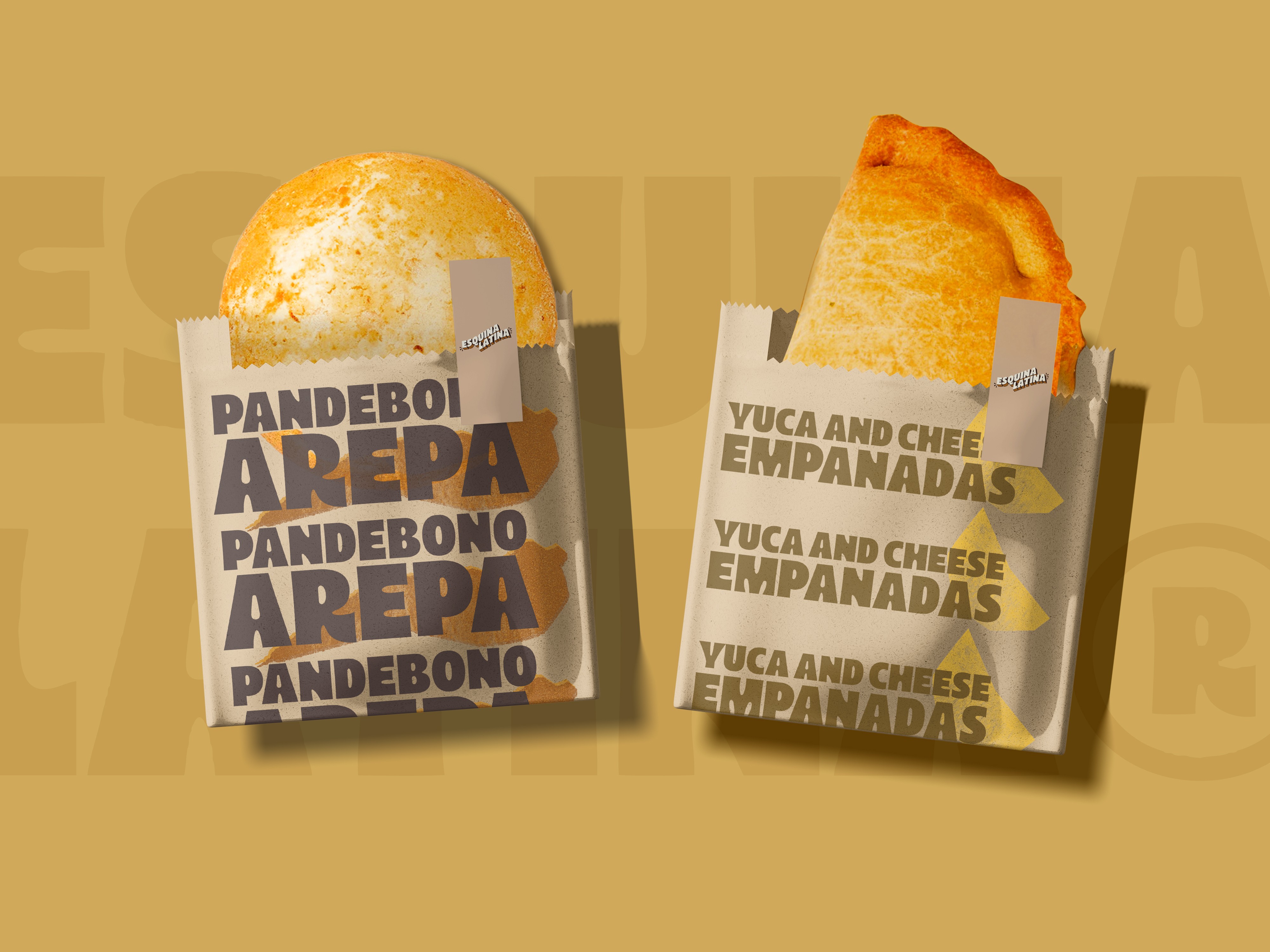
Illustrative language inspired by origin stories: The visual language draws inspiration from the roots—literally. We crafted illustrations that move from abstraction to origin, using symbolic representations of ingredients, territory, and handmade processes to deepen the emotional connection.

Creative Direction
Our creative approach was inspired by the emotional and cultural resonance of Latin American food traditions. The visual system uses organic shapes, earthy tones, and nostalgic typography to evoke feelings of warmth, family, and authenticity.
The brand’s storytelling is rooted in the idea of doing things “from the heart and from the root.” We translated this through hand-drawn details, a natural color palette, and packaging that feels close to the ground—simple, earthy, real.
Visual Elements Breakdown
Logo: A bold but organic logotype that balances structure and emotion
Color Palette: Earth (coffee, cream, green) meets sky (soft blue) to represent land and possibility
Typography: A mix of display fonts and geometric body fonts that blend tradition and clarity
Packaging: Clean layouts with expressive accents, reflecting handmade quality
Illustration: Abstract-to-origin visuals that represent ingredients and cultural identity
Impact
From Local Roots to National Shelves
An identity that grew beyond the brand—into the homes of thousands.
Thanks to a solid brand foundation rooted in authenticity, La Esquina Latina made the leap from a small kitchen concept to a standout product in Colombia’s retail space. Today, it’s proudly available in major national chains like Carulla and Éxito, proving that a culturally driven brand can succeed at scale without losing its essence.
This success reflects the power of strategy and storytelling in elevating products with heart. The design system didn’t just package arepas—it honored tradition, connected emotionally, and created a consistent visual language that consumers could recognize and trust on any shelf.

More Works
(GQ® — 02)
©2024


FAQ
01
How do you work with clients?
02
What’s your typical project timeline?
03
Do you offer strategy only services?
04
What makes you different from traditional agencies?
05
Are you really that involved in the process?
06
Can we start small and grow from there?
07
Do you have experience in our industry?
08
Can you help if we already have an internal team?
2024
Esquina Latina
Branding and packaging for a handcrafted, gluten-free arepa brand. Inspired by Latin American roots, we created a warm and authentic identity that connects tradition, flavor, and origin.
Brand Strategy
Packaging Design
Know More
Branding and packaging for a handcrafted, gluten-free arepa brand. Inspired by Latin American roots, we created a warm and authentic identity that connects tradition, flavor, and origin.
About the Brand
La Esquina Latina is a Latin American food brand that brings tradition to the modern table. With handmade, organic, and gluten-free arepas, their mission is to honor ancestral recipes while delivering flavor, authenticity, and heart.
Rooted in cultural heritage, their offering is simple but powerful: clean ingredients, traditional methods, and a deep connection to the land.
What We Did
To bring La Esquina Latina’s essence to life, we developed a full visual and strategic system grounded in cultural storytelling and product authenticity.
Brand strategy & manifesto: We defined the core brand narrative with a manifesto that speaks from the heart and highlights its Latin American roots. This message became the foundation for all visual and verbal communication.
Visual identity system: The logo and brandmark were created to be instantly recognizable, yet emotionally resonant—honoring the handmade nature of the product with soft, organic forms.
Color palette & typography: The earthy, grounded color palette was selected to represent the ingredients, geography, and warmth of the culture. Typography blends nostalgia and clarity, reflecting both tradition and modern appeal.
Packaging design: We designed packaging that communicates the artisanal, gluten-free promise of the brand. It’s clean but expressive, evoking a sense of care and origin.
Layout design for physical and digital touchpoints: Layout systems were built to be modular and consistent across formats, making the brand scalable and easy to apply in different contexts (menus, signage, print, digital, etc.).
Illustrative language inspired by origin stories: The visual language draws inspiration from the roots—literally. We crafted illustrations that move from abstraction to origin, using symbolic representations of ingredients, territory, and handmade processes to deepen the emotional connection.
Creative Direction
Our creative approach was inspired by the emotional and cultural resonance of Latin American food traditions. The visual system uses organic shapes, earthy tones, and nostalgic typography to evoke feelings of warmth, family, and authenticity.
The brand’s storytelling is rooted in the idea of doing things “from the heart and from the root.” We translated this through hand-drawn details, a natural color palette, and packaging that feels close to the ground—simple, earthy, real.
Visual Elements Breakdown
Logo: A bold but organic logotype that balances structure and emotion
Color Palette: Earth (coffee, cream, green) meets sky (soft blue) to represent land and possibility
Typography: A mix of display fonts and geometric body fonts that blend tradition and clarity
Packaging: Clean layouts with expressive accents, reflecting handmade quality
Illustration: Abstract-to-origin visuals that represent ingredients and cultural identity
Impact
From Local Roots to National Shelves
An identity that grew beyond the brand—into the homes of thousands.
Thanks to a solid brand foundation rooted in authenticity, La Esquina Latina made the leap from a small kitchen concept to a standout product in Colombia’s retail space. Today, it’s proudly available in major national chains like Carulla and Éxito, proving that a culturally driven brand can succeed at scale without losing its essence.
This success reflects the power of strategy and storytelling in elevating products with heart. The design system didn’t just package arepas—it honored tradition, connected emotionally, and created a consistent visual language that consumers could recognize and trust on any shelf.
More Works
(GQ® — 02)
©2024
FAQ
01
How do you work with clients?
02
What’s your typical project timeline?
03
Do you offer strategy only services?
04
What makes you different from traditional agencies?
05
Are you really that involved in the process?
06
Can we start small and grow from there?
07
Do you have experience in our industry?
08
Can you help if we already have an internal team?
2024
Esquina Latina
Branding and packaging for a handcrafted, gluten-free arepa brand. Inspired by Latin American roots, we created a warm and authentic identity that connects tradition, flavor, and origin.
Brand Strategy
Packaging Design
Know More
Branding and packaging for a handcrafted, gluten-free arepa brand. Inspired by Latin American roots, we created a warm and authentic identity that connects tradition, flavor, and origin.
About the Brand
La Esquina Latina is a Latin American food brand that brings tradition to the modern table. With handmade, organic, and gluten-free arepas, their mission is to honor ancestral recipes while delivering flavor, authenticity, and heart.
Rooted in cultural heritage, their offering is simple but powerful: clean ingredients, traditional methods, and a deep connection to the land.
What We Did
To bring La Esquina Latina’s essence to life, we developed a full visual and strategic system grounded in cultural storytelling and product authenticity.
Brand strategy & manifesto: We defined the core brand narrative with a manifesto that speaks from the heart and highlights its Latin American roots. This message became the foundation for all visual and verbal communication.
Visual identity system: The logo and brandmark were created to be instantly recognizable, yet emotionally resonant—honoring the handmade nature of the product with soft, organic forms.
Color palette & typography: The earthy, grounded color palette was selected to represent the ingredients, geography, and warmth of the culture. Typography blends nostalgia and clarity, reflecting both tradition and modern appeal.
Packaging design: We designed packaging that communicates the artisanal, gluten-free promise of the brand. It’s clean but expressive, evoking a sense of care and origin.
Layout design for physical and digital touchpoints: Layout systems were built to be modular and consistent across formats, making the brand scalable and easy to apply in different contexts (menus, signage, print, digital, etc.).
Illustrative language inspired by origin stories: The visual language draws inspiration from the roots—literally. We crafted illustrations that move from abstraction to origin, using symbolic representations of ingredients, territory, and handmade processes to deepen the emotional connection.
Creative Direction
Our creative approach was inspired by the emotional and cultural resonance of Latin American food traditions. The visual system uses organic shapes, earthy tones, and nostalgic typography to evoke feelings of warmth, family, and authenticity.
The brand’s storytelling is rooted in the idea of doing things “from the heart and from the root.” We translated this through hand-drawn details, a natural color palette, and packaging that feels close to the ground—simple, earthy, real.
Visual Elements Breakdown
Logo: A bold but organic logotype that balances structure and emotion
Color Palette: Earth (coffee, cream, green) meets sky (soft blue) to represent land and possibility
Typography: A mix of display fonts and geometric body fonts that blend tradition and clarity
Packaging: Clean layouts with expressive accents, reflecting handmade quality
Illustration: Abstract-to-origin visuals that represent ingredients and cultural identity
Impact
From Local Roots to National Shelves
An identity that grew beyond the brand—into the homes of thousands.
Thanks to a solid brand foundation rooted in authenticity, La Esquina Latina made the leap from a small kitchen concept to a standout product in Colombia’s retail space. Today, it’s proudly available in major national chains like Carulla and Éxito, proving that a culturally driven brand can succeed at scale without losing its essence.
This success reflects the power of strategy and storytelling in elevating products with heart. The design system didn’t just package arepas—it honored tradition, connected emotionally, and created a consistent visual language that consumers could recognize and trust on any shelf.
More Works
©2024
FAQ
How do you work with clients?
What’s your typical project timeline?
Do you offer strategy only services?
What makes you different from traditional agencies?
Are you really that involved in the process?
Can we start small and grow from there?
Do you have experience in our industry?
Can you help if we already have an internal team?