
2025
Latina Lux
Brand strategy and visual identity for a shapewear brand designed to empower Latina women. A system that balances sophistication, softness, and strength—just like its audience.
Brand Strategy
Visual Identity
Overview
Latina Lux was born from a simple but powerful insight: Latin beauty doesn’t need to be altered—it needs to be celebrated. The brand emerged as a response to the lack of shapewear that speaks to the real body, essence, and lifestyle of Latina women.
More than a product, Latina Lux offers a daily companion—a brand that embraces curves, movement, and identity with elegance, comfort, and authenticity.
What We Did
We partnered with Latina Lux to develop a full strategic and visual brand system rooted in empowerment without pressure, and luxury without pretense.
Narrative & Brand Voice: We crafted a story that redefines shapewear—not as a tool to hide, but as one to highlight what already makes each woman shine.
Visual Identity: From the elegant logotype to the sensual color palette, every element was designed to evoke confidence, softness, and warmth.
Typography System: A refined serif for elegance (New York) paired with a clean geometric sans (Futura) for balance and clarity.
Color Palette: Inspired by the diversity of Latin American skin tones, with warm neutrals and subtle earthy-pinks that feel both luxurious and inclusive.
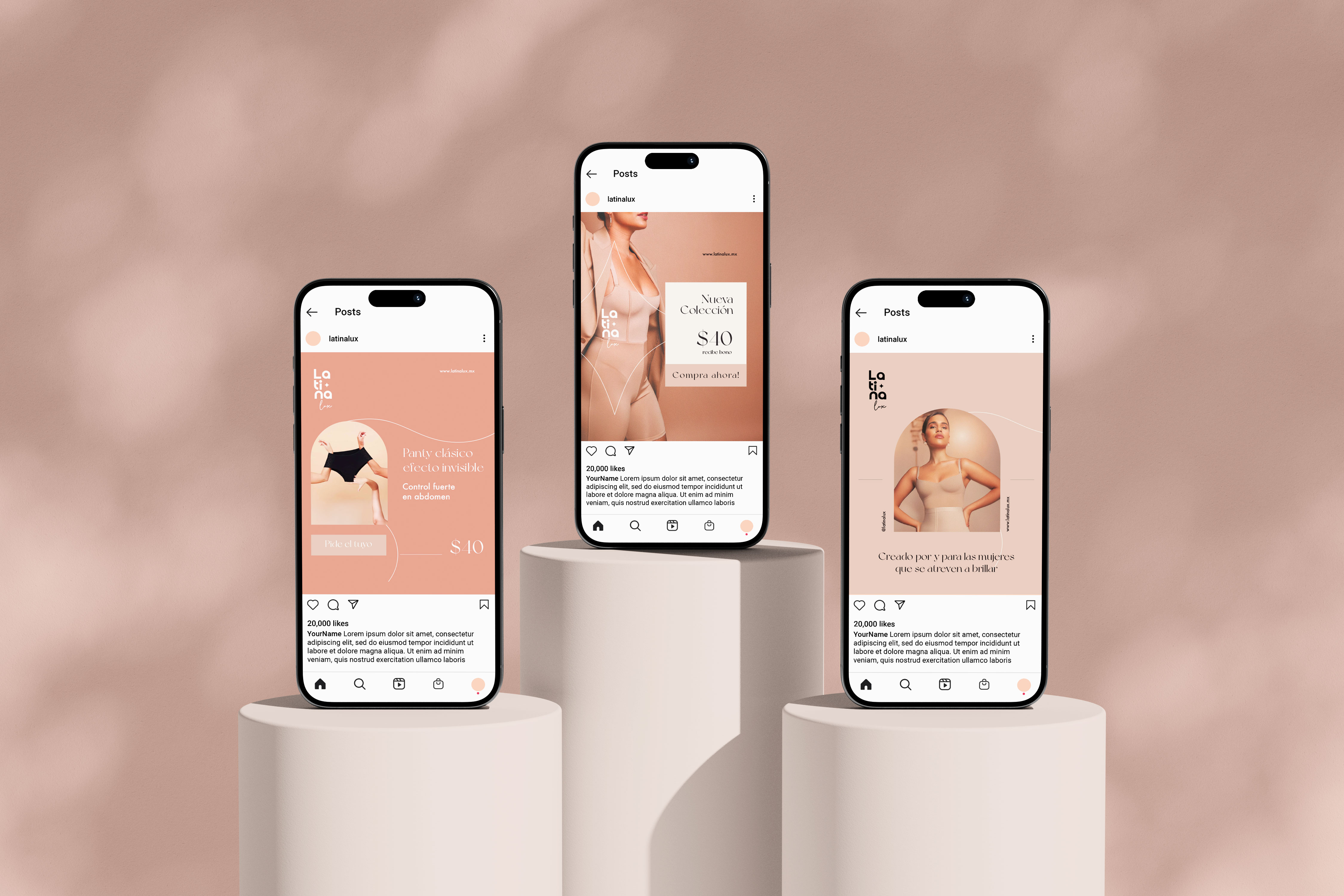
Product & Packaging Applications: We translated the brand identity into packaging, digital content, and promotional material focused on highlighting comfort and beauty equally.
Creative Direction
The creative direction focused on elevating the feminine form without restricting it, reflecting Latina Lux’s purpose: to make women feel confident, understood, and radiant.
The identity is built around contrast—soft curves and bold posture, light and grounding tones, luxury and everyday usability. Visual details such as a handwritten stroke on the word Lux add a personal, premium touch, while the strong verticality of the logotype echoes elegance and inner strength.
We leaned into a voice that was protective and inspiring, rooted in self-love rather than self-correction. Everything—from the choice of colors to the brand’s taglines—reinforces one message: You are already enough.


Visual Elements Breakdown
Designing elegance that fits every curve
A brand identity that embraces Latin femininity through softness, structure, and soul.
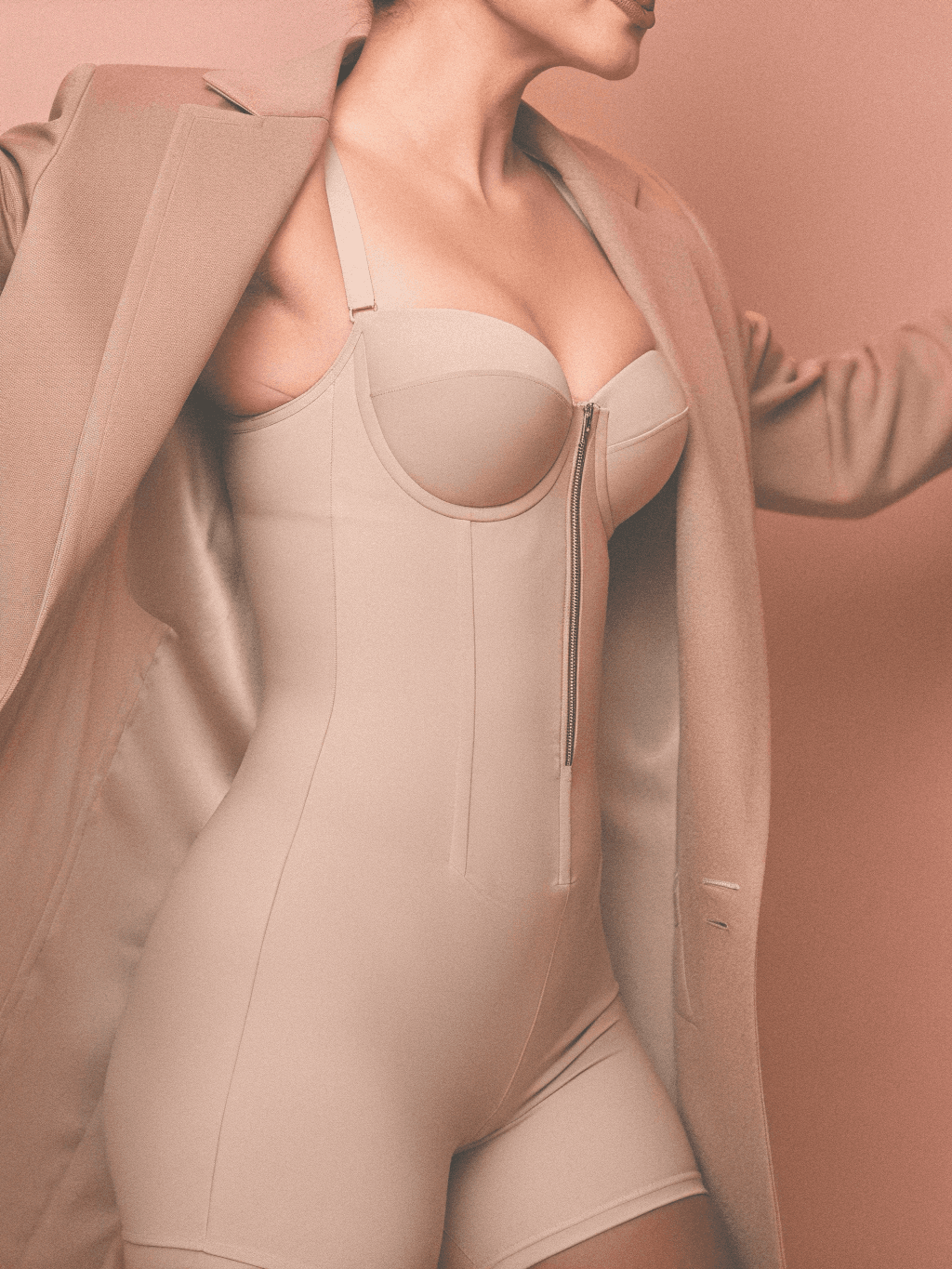
The visual system for Latina Lux was crafted to reflect both the emotional and physical experience of wearing the brand: feeling powerful, secure, and celebrated in your own skin. We designed each element to resonate with the complexity of the Latina woman—strong yet soft, bold yet graceful.
Logo
A tall and confident wordmark that integrates smooth, rounded letterforms—evoking the natural curves of the body. The subtle spark detail embedded in the logo becomes a metaphor for inner radiance and luxury.
Color Palette
Inspired by the richness of Latin American skin tones, the palette combines warm neutrals to deliver timeless elegance, inclusivity, and a sense of care.Typography
The mix of New York for headings and Futura Medium for body text creates a balance between high-end sophistication and modern readability, supporting brand messages with clarity and grace.Imagery Style
Our direction favors intimate, editorial-style visuals that highlight real bodies in motion. Natural light, soft contrast, and minimal post-production create a feeling of authenticity and everyday glamour.Applications
Every brand element was scaled across key touchpoints—social content, packaging, product tags, print ads, and in-store communication—to maintain consistency and create a cohesive brand experience at every moment of interaction.
Impact
Empowerment by Design
More than a rebrand—an emotional shift in how Latina women see and celebrate themselves.
Latina Lux redefined what shapewear means for modern Latina women by shifting the conversation from "correction" to celebration. The brand positioned itself as a premium, emotionally intelligent alternative in a market often dominated by restrictive standards. Through thoughtful messaging, elegant aesthetics, and a deep understanding of its audience’s emotional and physical needs, Latina Lux stood out as a brand with soul and purpose.
The branding resonated across every touchpoint—digital, print, and packaging—creating a cohesive and immersive experience that made women feel seen, not sculpted. Latina Lux became more than just a product; it became a daily ritual of confidence. This alignment between strategy, story, and design laid the foundation for long-term brand trust, loyalty, and growth in a competitive and culturally sensitive category.

More Works
(GQ® — 02)
©2024

FAQ
01
How do you work with clients?
02
What’s your typical project timeline?
03
Do you offer strategy only services?
04
What makes you different from traditional agencies?
05
Are you really that involved in the process?
06
Can we start small and grow from there?
07
Do you have experience in our industry?
08
Can you help if we already have an internal team?
2025
Latina Lux
Brand strategy and visual identity for a shapewear brand designed to empower Latina women. A system that balances sophistication, softness, and strength—just like its audience.
Brand Strategy
Visual Identity
Overview
Latina Lux was born from a simple but powerful insight: Latin beauty doesn’t need to be altered—it needs to be celebrated. The brand emerged as a response to the lack of shapewear that speaks to the real body, essence, and lifestyle of Latina women.
More than a product, Latina Lux offers a daily companion—a brand that embraces curves, movement, and identity with elegance, comfort, and authenticity.
What We Did
We partnered with Latina Lux to develop a full strategic and visual brand system rooted in empowerment without pressure, and luxury without pretense.
Narrative & Brand Voice: We crafted a story that redefines shapewear—not as a tool to hide, but as one to highlight what already makes each woman shine.
Visual Identity: From the elegant logotype to the sensual color palette, every element was designed to evoke confidence, softness, and warmth.
Typography System: A refined serif for elegance (New York) paired with a clean geometric sans (Futura) for balance and clarity.
Color Palette: Inspired by the diversity of Latin American skin tones, with warm neutrals and subtle earthy-pinks that feel both luxurious and inclusive.
Product & Packaging Applications: We translated the brand identity into packaging, digital content, and promotional material focused on highlighting comfort and beauty equally.
Creative Direction
The creative direction focused on elevating the feminine form without restricting it, reflecting Latina Lux’s purpose: to make women feel confident, understood, and radiant.
The identity is built around contrast—soft curves and bold posture, light and grounding tones, luxury and everyday usability. Visual details such as a handwritten stroke on the word Lux add a personal, premium touch, while the strong verticality of the logotype echoes elegance and inner strength.
We leaned into a voice that was protective and inspiring, rooted in self-love rather than self-correction. Everything—from the choice of colors to the brand’s taglines—reinforces one message: You are already enough.
Visual Elements Breakdown
Designing elegance that fits every curve
A brand identity that embraces Latin femininity through softness, structure, and soul.
The visual system for Latina Lux was crafted to reflect both the emotional and physical experience of wearing the brand: feeling powerful, secure, and celebrated in your own skin. We designed each element to resonate with the complexity of the Latina woman—strong yet soft, bold yet graceful.
Logo
A tall and confident wordmark that integrates smooth, rounded letterforms—evoking the natural curves of the body. The subtle spark detail embedded in the logo becomes a metaphor for inner radiance and luxury.
Color Palette
Inspired by the richness of Latin American skin tones, the palette combines warm neutrals to deliver timeless elegance, inclusivity, and a sense of care.Typography
The mix of New York for headings and Futura Medium for body text creates a balance between high-end sophistication and modern readability, supporting brand messages with clarity and grace.Imagery Style
Our direction favors intimate, editorial-style visuals that highlight real bodies in motion. Natural light, soft contrast, and minimal post-production create a feeling of authenticity and everyday glamour.Applications
Every brand element was scaled across key touchpoints—social content, packaging, product tags, print ads, and in-store communication—to maintain consistency and create a cohesive brand experience at every moment of interaction.
Impact
Empowerment by Design
More than a rebrand—an emotional shift in how Latina women see and celebrate themselves.
Latina Lux redefined what shapewear means for modern Latina women by shifting the conversation from "correction" to celebration. The brand positioned itself as a premium, emotionally intelligent alternative in a market often dominated by restrictive standards. Through thoughtful messaging, elegant aesthetics, and a deep understanding of its audience’s emotional and physical needs, Latina Lux stood out as a brand with soul and purpose.
The branding resonated across every touchpoint—digital, print, and packaging—creating a cohesive and immersive experience that made women feel seen, not sculpted. Latina Lux became more than just a product; it became a daily ritual of confidence. This alignment between strategy, story, and design laid the foundation for long-term brand trust, loyalty, and growth in a competitive and culturally sensitive category.
More Works
(GQ® — 02)
©2024
FAQ
01
How do you work with clients?
02
What’s your typical project timeline?
03
Do you offer strategy only services?
04
What makes you different from traditional agencies?
05
Are you really that involved in the process?
06
Can we start small and grow from there?
07
Do you have experience in our industry?
08
Can you help if we already have an internal team?
2025
Latina Lux
Brand strategy and visual identity for a shapewear brand designed to empower Latina women. A system that balances sophistication, softness, and strength—just like its audience.
Brand Strategy
Visual Identity
Overview
Latina Lux was born from a simple but powerful insight: Latin beauty doesn’t need to be altered—it needs to be celebrated. The brand emerged as a response to the lack of shapewear that speaks to the real body, essence, and lifestyle of Latina women.
More than a product, Latina Lux offers a daily companion—a brand that embraces curves, movement, and identity with elegance, comfort, and authenticity.
What We Did
We partnered with Latina Lux to develop a full strategic and visual brand system rooted in empowerment without pressure, and luxury without pretense.
Narrative & Brand Voice: We crafted a story that redefines shapewear—not as a tool to hide, but as one to highlight what already makes each woman shine.
Visual Identity: From the elegant logotype to the sensual color palette, every element was designed to evoke confidence, softness, and warmth.
Typography System: A refined serif for elegance (New York) paired with a clean geometric sans (Futura) for balance and clarity.
Color Palette: Inspired by the diversity of Latin American skin tones, with warm neutrals and subtle earthy-pinks that feel both luxurious and inclusive.
Product & Packaging Applications: We translated the brand identity into packaging, digital content, and promotional material focused on highlighting comfort and beauty equally.
Creative Direction
The creative direction focused on elevating the feminine form without restricting it, reflecting Latina Lux’s purpose: to make women feel confident, understood, and radiant.
The identity is built around contrast—soft curves and bold posture, light and grounding tones, luxury and everyday usability. Visual details such as a handwritten stroke on the word Lux add a personal, premium touch, while the strong verticality of the logotype echoes elegance and inner strength.
We leaned into a voice that was protective and inspiring, rooted in self-love rather than self-correction. Everything—from the choice of colors to the brand’s taglines—reinforces one message: You are already enough.
Visual Elements Breakdown
Designing elegance that fits every curve
A brand identity that embraces Latin femininity through softness, structure, and soul.
The visual system for Latina Lux was crafted to reflect both the emotional and physical experience of wearing the brand: feeling powerful, secure, and celebrated in your own skin. We designed each element to resonate with the complexity of the Latina woman—strong yet soft, bold yet graceful.
Logo
A tall and confident wordmark that integrates smooth, rounded letterforms—evoking the natural curves of the body. The subtle spark detail embedded in the logo becomes a metaphor for inner radiance and luxury.
Color Palette
Inspired by the richness of Latin American skin tones, the palette combines warm neutrals to deliver timeless elegance, inclusivity, and a sense of care.Typography
The mix of New York for headings and Futura Medium for body text creates a balance between high-end sophistication and modern readability, supporting brand messages with clarity and grace.Imagery Style
Our direction favors intimate, editorial-style visuals that highlight real bodies in motion. Natural light, soft contrast, and minimal post-production create a feeling of authenticity and everyday glamour.Applications
Every brand element was scaled across key touchpoints—social content, packaging, product tags, print ads, and in-store communication—to maintain consistency and create a cohesive brand experience at every moment of interaction.
Impact
Empowerment by Design
More than a rebrand—an emotional shift in how Latina women see and celebrate themselves.
Latina Lux redefined what shapewear means for modern Latina women by shifting the conversation from "correction" to celebration. The brand positioned itself as a premium, emotionally intelligent alternative in a market often dominated by restrictive standards. Through thoughtful messaging, elegant aesthetics, and a deep understanding of its audience’s emotional and physical needs, Latina Lux stood out as a brand with soul and purpose.
The branding resonated across every touchpoint—digital, print, and packaging—creating a cohesive and immersive experience that made women feel seen, not sculpted. Latina Lux became more than just a product; it became a daily ritual of confidence. This alignment between strategy, story, and design laid the foundation for long-term brand trust, loyalty, and growth in a competitive and culturally sensitive category.
More Works
©2024
FAQ
How do you work with clients?
What’s your typical project timeline?
Do you offer strategy only services?
What makes you different from traditional agencies?
Are you really that involved in the process?
Can we start small and grow from there?
Do you have experience in our industry?
Can you help if we already have an internal team?