
2024
H Apparel
A bold rebrand for a sustainable fashion label. We developed a dynamic visual system with soft curves and iridescent textures, blending approachability and impact across every touchpoint.
Brand Experience
Visual Identity
Overview
H Apparel is a sustainable clothing brand focused on empowering self-expression through playful design and conscious choices. With an audience rooted in youth culture and eco-awareness, the brand needed a fresh visual identity to reflect both its creativity and its values.
What We Did
To bring new life into the brand, we developed a cohesive rebranding system centered on balance: bold yet soft, expressive yet structured.
Logo Design: A voluminous, organic typeface that conveys playfulness and warmth, while remaining recognizable and scalable.
Color & Texture: A unique gradient system inspired by iridescent materials and fluid shapes, projecting movement, lightness, and innovation.
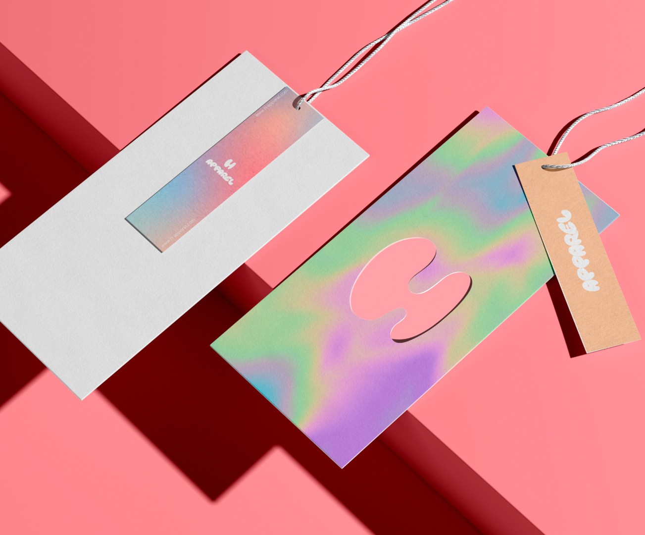
Packaging: Fully redesigned boxes, tags, and wrapping with tactile appeal and layered color stories—designed to enhance unboxing moments.
Campaign Art Direction: A visual world that merges streetwear culture with a soft, inclusive visual tone across retail and outdoor displays.
Brand System: Guidelines to ensure cohesion across web, print, and product labels with visual elements that scale and adapt.

Creative Direction
The creative concept behind H Apparel’s new identity was rooted in the idea that softness is not weakness, but a modern form of power. In a market saturated with boldness for the sake of attention, we chose to stand out by embracing fluidity, inclusivity, and emotional connection.
Rather than pushing for noise, we opted for rounded, voluminous shapes and a palette of soft, iridescent gradients that speak to inner strength, ease, and confidence. The brand now communicates a sense of calm boldness—inviting rather than intimidating, expressive rather than excessive.
This approach was inspired by the new generation of consumers who prioritize self-expression, sustainability, and emotional intelligence. We wanted the brand to feel like a safe space in visual form: one where creativity flows, where softness is stylish, and where the lines between fashion and identity are beautifully blurred.
Every brand touchpoint—packaging, tags, outdoor, and digital—was carefully considered to deliver this feeling of fluid energy. The gradients move like fabric in motion. The typography feels as if it could expand or contract with your body. The overall identity becomes wearable, livable, and shareable.


Visual Elements Breakdown
A fluid system designed to express softness, movement, and modern identity.
From typography to textures, every element was crafted to reflect the brand’s duality—playful yet grounded, light yet bold. This is a visual language built to move, connect, and stand out.
Typography
We developed a custom logotype using a soft, voluminous typeface with rounded terminals and generous spacing. Its inflated, almost bubble-like form balances approachability and boldness, reflecting a playful yet confident tone. This typography speaks directly to a Gen Z audience—inviting, expressive, and instantly recognizable across digital and physical formats.
Color System
The brand’s palette is built around iridescent gradients that blend pastel pinks, mints, purples, and soft blues. These tones evoke a dreamy, futuristic vibe while maintaining a sense of calm and freshness. Inspired by oil slicks, holographic textures, and filtered light, the palette adapts beautifully across print, packaging, digital interfaces, and outdoor media.Materials
We created contrast through tactile layering: matte paper and kraft textures are juxtaposed with holographic foils, transparent plastic, and pearlescent finishes. This combination enhances the sensory experience and reinforces the brand's duality—soft but striking, grounded yet elevated.Packaging
Unboxing is treated as a brand ritual. From iridescent-printed boxes to custom die-cut hangtags, every element is designed to feel collectible. The multi-layered system includes gradient tissue paper, reusable stickers, and a brand seal that echoes the "H" silhouette—turning everyday packaging into a moment of delight and shareability.Applications
The brand flexes effortlessly across touchpoints. We designed visual assets for billboards, e-commerce, editorial, and retail packaging, ensuring a coherent presence from digital campaigns to in-store displays. The consistent use of organic shapes and fluid lines ties everything together while allowing adaptability across mediums.

Impact
A softer identity with sharper results
The rebrand helped position H Apparel as a standout name in youth-driven sustainable fashion. By creating a visually cohesive and emotionally engaging system, the brand now resonates more strongly with its audience—and confidently competes in a crowded market
From online retail to physical spaces, the new identity creates moments of connection that feel personal, fresh, and ready to wear.
More Works
(GQ® — 02)
©2024
FAQ
01
How do you work with clients?
02
What’s your typical project timeline?
03
Do you offer strategy only services?
04
What makes you different from traditional agencies?
05
Are you really that involved in the process?
06
Can we start small and grow from there?
07
Do you have experience in our industry?
08
Can you help if we already have an internal team?
2024
H Apparel
A bold rebrand for a sustainable fashion label. We developed a dynamic visual system with soft curves and iridescent textures, blending approachability and impact across every touchpoint.
Brand Experience
Visual Identity
Overview
H Apparel is a sustainable clothing brand focused on empowering self-expression through playful design and conscious choices. With an audience rooted in youth culture and eco-awareness, the brand needed a fresh visual identity to reflect both its creativity and its values.
What We Did
To bring new life into the brand, we developed a cohesive rebranding system centered on balance: bold yet soft, expressive yet structured.
Logo Design: A voluminous, organic typeface that conveys playfulness and warmth, while remaining recognizable and scalable.
Color & Texture: A unique gradient system inspired by iridescent materials and fluid shapes, projecting movement, lightness, and innovation.
Packaging: Fully redesigned boxes, tags, and wrapping with tactile appeal and layered color stories—designed to enhance unboxing moments.
Campaign Art Direction: A visual world that merges streetwear culture with a soft, inclusive visual tone across retail and outdoor displays.
Brand System: Guidelines to ensure cohesion across web, print, and product labels with visual elements that scale and adapt.
Creative Direction
The creative concept behind H Apparel’s new identity was rooted in the idea that softness is not weakness, but a modern form of power. In a market saturated with boldness for the sake of attention, we chose to stand out by embracing fluidity, inclusivity, and emotional connection.
Rather than pushing for noise, we opted for rounded, voluminous shapes and a palette of soft, iridescent gradients that speak to inner strength, ease, and confidence. The brand now communicates a sense of calm boldness—inviting rather than intimidating, expressive rather than excessive.
This approach was inspired by the new generation of consumers who prioritize self-expression, sustainability, and emotional intelligence. We wanted the brand to feel like a safe space in visual form: one where creativity flows, where softness is stylish, and where the lines between fashion and identity are beautifully blurred.
Every brand touchpoint—packaging, tags, outdoor, and digital—was carefully considered to deliver this feeling of fluid energy. The gradients move like fabric in motion. The typography feels as if it could expand or contract with your body. The overall identity becomes wearable, livable, and shareable.
Visual Elements Breakdown
A fluid system designed to express softness, movement, and modern identity.
From typography to textures, every element was crafted to reflect the brand’s duality—playful yet grounded, light yet bold. This is a visual language built to move, connect, and stand out.
Typography
We developed a custom logotype using a soft, voluminous typeface with rounded terminals and generous spacing. Its inflated, almost bubble-like form balances approachability and boldness, reflecting a playful yet confident tone. This typography speaks directly to a Gen Z audience—inviting, expressive, and instantly recognizable across digital and physical formats.
Color System
The brand’s palette is built around iridescent gradients that blend pastel pinks, mints, purples, and soft blues. These tones evoke a dreamy, futuristic vibe while maintaining a sense of calm and freshness. Inspired by oil slicks, holographic textures, and filtered light, the palette adapts beautifully across print, packaging, digital interfaces, and outdoor media.Materials
We created contrast through tactile layering: matte paper and kraft textures are juxtaposed with holographic foils, transparent plastic, and pearlescent finishes. This combination enhances the sensory experience and reinforces the brand's duality—soft but striking, grounded yet elevated.Packaging
Unboxing is treated as a brand ritual. From iridescent-printed boxes to custom die-cut hangtags, every element is designed to feel collectible. The multi-layered system includes gradient tissue paper, reusable stickers, and a brand seal that echoes the "H" silhouette—turning everyday packaging into a moment of delight and shareability.Applications
The brand flexes effortlessly across touchpoints. We designed visual assets for billboards, e-commerce, editorial, and retail packaging, ensuring a coherent presence from digital campaigns to in-store displays. The consistent use of organic shapes and fluid lines ties everything together while allowing adaptability across mediums.
Impact
A softer identity with sharper results
The rebrand helped position H Apparel as a standout name in youth-driven sustainable fashion. By creating a visually cohesive and emotionally engaging system, the brand now resonates more strongly with its audience—and confidently competes in a crowded market
From online retail to physical spaces, the new identity creates moments of connection that feel personal, fresh, and ready to wear.
More Works
©2024
FAQ
How do you work with clients?
What’s your typical project timeline?
Do you offer strategy only services?
What makes you different from traditional agencies?
Are you really that involved in the process?
Can we start small and grow from there?
Do you have experience in our industry?
Can you help if we already have an internal team?